Saturday, 14 April 2012

Magazine Advert


This magazine advert will feature in the Studio 5 magazine that I created for my AS coursework. The magazine was created by the band Studio 5 and is a good promoting tool for the band.  

Stage 4:


I thought it needed something else to brighten the advert up I thought I could do what I did with the digipak booklet and make some paint splatters to put around the edges of the magazine advert. This would reflect the bands characters as if they are free with their music. 

Stage 3:


I then uploaded the logos to make the Magazine advert more official I added the Studio 5 logo, EMI logo and Sony BMG logo. 

Stage 2:


Then I added a black background and used the "Colleged" font found down below, I used this font because it is in keeping with the old school theme.


Stage 1:


First I uploaded the image of the band and changed the  Hue/Saturation, colour balance and brightness to make the image more presentable.

Plan:


Images I Have Used:

Mock Magazine Advert


I then added on the words so the audience know what this advert it advertising, in this case the bands new album. I used the "Colleged" font found on the website down below, this font also gives the feel of a school.
http://www.dafont.com/colleged.font

Stage 2:


I then added on an image of old school paper that I had found on the internet. I chose this image because it gives it the feel of being in a school environment and reflects the feeling of the songs in this album.


Stage 1:


First I uploaded the image I used from the mock album cover and deleted the words, I placed the image at the top of the page.


Plan:

Images I have used:

(Click on the images to see a bigger version)

Digipak Booklet


Digipaks have booklets inside of the album, little bios of the artist and any exclusive content, so I took that idea and made my own digipak booklet.


My Version of a Digipak Booklet 


I first made the black background on the information pages, I got most of the images from the Digipak and placed them on the pages, the only one's that are new are the 3D glasses, in which I took the white background off with the background eraser on Photoshop and snapshots of the band in the music video. The font I used is for the titles is Colleged, to give it the old school effect, for the information I just used Arial font. Then I put on the paint splatters to give it a relaxed and free feel which is to show the bands persona.

Digipak


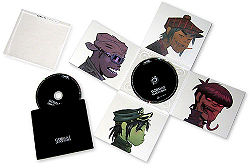
Digipaks are a form of packaging used not only to sell the CD but the persona of the artiest and if the audience is a fan it can be seen as a collectors item. For me to get an idea in to what a digipak is , I looked at similar artiest and their Digipaks to get some ideas on how to set my one up. 


My Version of a Digipak:


First I uploaded the image of the band and changed the  Hue/Saturation, colour balance and brightness to make the image more professional. Then I added the black background the the inside left panel and added the Polaroid images that I used the the music video. Then I changed the images of the close ups of the band by taking away the background the with background eraser and mask cropped the image and changed it with the poster edge effect, so it looks like a cartoon, I added the writing on the front and back cover the front I used was Colleged the link is below.


I then added on the logos and small print to make it more realistic and advises the audiences what is in the album and if there are any extras. I changed the colour of the CD panel to a dark grey and created paint splatters to put all over the CD and then put on the name of the band and the title of the album.


Images I have used:


Mock Album Cover


I first got the image of the old school gym and used the filter option and when to poster edge effect on Photoshop, this makes it look like a cartoon and gives it a child like feel. Then I added the band image and took away the white background with the background eraser, it looks like the band are in the gym. Then I wrote the bands name and the title of the new album, the font I used was Colleged, I found it on a fonts website and the link is below.

http://www.dafont.com/search.php?psize=m&q=colleged


Images I used:


Music Video


3D Version of my Music Video:

Film Schedule

I plan to film most of my video in the old school gym and so will take about 1 to 3 hours shooting various angles and movements of the band playing, for example closeups, tracking shots, pans, long shots, mid shots high angle, low angle etc.


I have to shoot the whole song again and again in the different angles and movements, so I have as much footage as possible to edit with.

Animatic


Copyright Letter


Saturday, 7 April 2012

Production Time Line


For me to get this project from paper to product I had to come up with a check list of what I have to do before I shoot my music video down below you can see the list.

  • Make sure my camera is ready to use and with a suitable tripod
  • Get permission for the location (old school gym) 
  • Get permission and purchase props:
          Musical instruments (drum kit, electric guitar, acoustic guitar, microphone, amps)
          Pizza boxes
          Drink cans
          Party stuff (balloons, bunting)
          Gym equipment (mini trampoline, box top with wheels)

  • Make sure I have the correct amount of actors that can work at a certain time (make sure they have the same free periods or are available after school)  

Get this all done by the 15th March so I have time to plan what time i have to shoot and edit my music video.

Pitch Board of images of Video Production


These are images that are associated with location, costumes, mise-en-scene (not the real items because this is a plan).

Lyric Deconstruction


Directors Pitch Activity


Audience Mood Board


Tuesday, 3 April 2012

Episode 5: Analysing Adverts


A Bit More Information About The Adverts:

Gorillaz:


The font is easy to read and with a range of colors to attract the audience's eye into the poster. This will get them to buy the Gorillaz tickets for their tour. Has clear instructions on how to get the tickets though calling them and on a couple of websites. The Mise-en-Scene is simple with just the instruments and the artiest in reality and animation form, this is to make the poster interesting but not confuse the reader. the language used used is also clear and gets to the point with just information on how to get the band tickets. the central dominate images of the band are looking straight at the audience to make them have a personal connects and make the audience part of the band.


Blink 182:


The color of the advert is simple with just tones of black and white, this is to not confused the reader making them read the information on the advert,the central dominate image takes up most of the adverts and is of the name of the band and the location of a neighborhood which is what their album is all about. just like the Gorillaz one it just has information about when the album is out and what it is called. The official website is at the bottom of the advert so if the reader wants to find out more about the album they can do. At the bottom of the advert there are logos of production companies who help with the making of the album and music.


These have helped me with ideas on how to set out my advert and how it just needs short information so the audience does not get bored, but also have a range of color and images to catch the audiences eye. it needs a good balance of writing and images.